
GiTheme
Developed by Simone Fioravanti
 Download
Theme Description
A lightweight, accessibility-minded classic theme for ClassicPress, built with modern CSS and progressive enhancement.
githeme combines a clean, adaptable foundation with native ClassicPress features. It favors readable typography, predictable navigation, and straightforward customization—without a frontend framework, a required asset build step, or mandatory plugins.
- Accessibility-minded by design. Semantic page structure, a skip link, visible keyboard focus, keyboard-accessible navigation, and support for reduced-motion preferences where applicable.
- Readable, locally hosted typography. Choose a system font stack, Source Sans 3, Source Serif 4, or Atkinson Hyperlegible Next. No external font service is required.
- Modern, responsive CSS. Custom properties, Grid, Flexbox, relative sizing, and configurable content widths help layouts adapt to different screens.
- Progressive enhancement. Navigation remains usable when JavaScript is disabled; scripts enhance behavior rather than provide the only route to content.
- Native customization. Adjust colors, typography, layout widths, header arrangement, logo presentation, and header/footer backgrounds through the ClassicPress Customizer.
- ClassicPress-first architecture. Traditional PHP templates, the classic editor, native menus, comments, and widget areas; no built-in page builder or block-editor dependency.
- Optional plugin styling. When FX Shortcodes is active, selected components inherit the theme’s visual language without changing the plugin’s rendering or overriding explicit shortcode styling.
The Customizer provides a shared visual system for the site, including primary and secondary colors, text and link colors, independent header and footer backgrounds, font selection, heading scale, content widths, and header layout.
An informational contrast checker evaluates seven text/background combinations and provides feedback without silently changing the colors you choose. The classic editor also receives corresponding typography and color settings.
githeme provides theme-aware styling for five FX Shortcodes components: Button, Card, Cover, Details, and Separator.
The integration uses the existing Customizer palette, respects explicit component attributes, and adds no separate settings or required plugin dependency. FX Shortcodes supplies the components and their behavior; githeme supplies visual consistency with the surrounding site. Other FX plugins may be used independently, without dedicated theme styling.
- Install and activate
githemethrough Appearance → Themes in ClassicPress. - Assign a menu to the Primary menu location.
- Optionally add a logo and adjust the theme’s appearance in the Customizer.
- To use a static homepage, select a published page under Settings → Reading. Optional Homepage Hero and Homepage Content widget areas can complement its content.
The theme works without FX Shortcodes, FX Builder, or FX Builder Widgets. Content authored with a particular plugin may still require that plugin to render correctly.
Select a static homepage under Settings → Reading, then add native widgets through Appearance → Widgets:
-
Homepage Hero (
homepage-hero) appears after the header and navigation, before the page content. Widgets can use the full available width. -
Homepage Content (
homepage-content) appears after the page content, before the footer.
Both areas are optional and appear only on the static front page—not on the latest-posts homepage, a separate posts page, or internal pages. Areas without widget output add no empty wrappers. Leaving both areas empty keeps the normal static page rendering; the page’s own content remains editable in the classic editor. No plugin is required.
A native Text widget can also contain a gallery slider, including in Homepage Hero.
Add GiTheme – Featured Posts through Appearance → Widgets to Homepage Hero, Homepage Content, Footer, or another registered widget area. It reuses the category archive cards and adapts to the available width, with up to three columns. No plugin is required.
Choose Latest published posts, Posts in a category (including its descendants), or Manual post IDs. Automatic modes default to three posts and accept 1–50; manual mode uses the comma-separated IDs in the supplied order and ignores the automatic count. Only published posts are shown. Duplicate, missing, unpublished, or non-post IDs are skipped; empty results produce no widget output. The widget title is optional.
Category mode labels cards within the selected category branch, falling back to that category. The other modes use the deepest assigned category, choosing the lowest term ID on equal depths. Cards retain native excerpts and omit the image area when no featured image is available. No separate visual settings are added.
Use Row Settings → Width: Default → Additional CSS class(es): githeme-wide to extend an FX Builder row to the maximum layout width configured in the Customizer (--width-layout). The row stays centered within the available content area and shrinks on small screens. Default rows without the class retain the editorial content width; Full Width rows keep the plugin’s native behavior. Columns, gaps, padding, and responsive breakpoints remain controlled by FX Builder.
This optional CSS integration requires a browser supporting :has(). Without that support, the row remains constrained by its normal editorial-width container. It adds no required plugin dependency or Customizer setting.
In the page editor, enable Hide page title in the Page title box to omit the template heading for that page. Titles are visible by default. This does not change the saved title, document title, headings in the content, or builder-generated headings. Posts and archives are unaffected. Autosaves and revisions do not overwrite this page preference.
Category archives use a responsive card grid: three columns on desktop, two on tablet, and one on mobile, adapting to the available container width. Cards display a 16:9 featured image, a title, and the native excerpt, preferring a manual excerpt when provided. Posts without a featured image remain readable cards without artificial placeholders.
An image overlay names the most specific assigned subcategory relevant to the current archive, or the current category when no such subcategory is assigned. Colors and typography follow the theme settings. Centered native pagination shows 12 posts per page.
This layout applies only to category archives; other archive types keep their existing presentation.
Add layout="slider" to the native gallery shortcode in the classic editor or a native Text widget:
Replace the example IDs with image attachment IDs from your media library. Galleries without layout="slider" keep their standard behavior, including the native thumbnail size default. Slider galleries default to large unless you explicitly provide size, such as size="medium" or size="full".
When native dimensions are available for every image, slider images share a responsive height with proportional widths, without cropping or distortion. The common height is limited by the smallest source image, avoiding enlargement of small images; a low-resolution image can therefore reduce the height of the whole gallery. Missing dimension metadata or a browser without CSS container units keeps natural image heights instead.
The slider uses native horizontal scrolling and CSS Scroll Snap. With JavaScript, previous/next buttons appear when scrolling is needed, and focused image links are brought into view. Use Tab and Shift+Tab for links and controls, or arrow keys on the focusable scrolling area. Touch, trackpad, and the native scrollbar remain available. Button navigation uses smooth scrolling unless reduced motion is preferred; focus corrections are immediate. There is no autoplay.
Without JavaScript, the gallery remains usable through native scrolling and keyboard navigation, with no inactive buttons. Automatic focus correction is an enhancement: the browser may leave a focused image partially visible until you scroll further.
Use the shortcode in a Text widget to place a slider in a homepage widget area. The native Gallery widget renders a standard gallery and does not expose the slider option; use a Text widget instead. No gallery plugin is required.
Slider enhancement requires PHP’s DOM extension and recognizable native gallery markup. Empty, single-image, and feed output stays native; plugins that replace gallery markup may prevent enhancement.
Add GiTheme – Gallery Slider through Appearance → Widgets, then enter an optional title and comma-separated image attachment IDs in the desired order. It works in any registered widget area without requiring a builder plugin and can be used alongside FX Builder Widgets.
The widget renders the same native 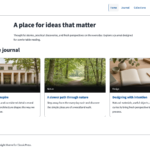
Minimum requirements: ClassicPress 2.7 and PHP 8.2. Gallery slider enhancement additionally needs PHP’s DOM extension; without it, galleries retain native rendering.
Development and regression testing have been carried out with PHP 8.2 and a ClassicPress 2.7.4+dev checkout containing the Customizer changes intended for ClassicPress 2.8. These describe the automated test environment, not a complete compatibility matrix. The maintainer also manually verified Customizer controls on ClassicPress 2.7; this is separate from automated coverage and does not imply that every feature was tested on that version.
Accessibility is a continuing design and testing goal, not a claim of WCAG certification. Automated and browser checks do not replace testing with screen readers, real touch devices, or browser zoom. Site content, color choices, and third-party plugins also affect accessibility.
- English (original)
- British English (
en_GB) - Italian (
it_IT) - German (
de_DE) - Dutch (
nl_NL)
githeme is licensed under GPL-3.0-or-later. See LICENSE. Bundled fonts retain their respective SIL Open Font License 1.1 terms; their licenses and provenance are included with the font files.